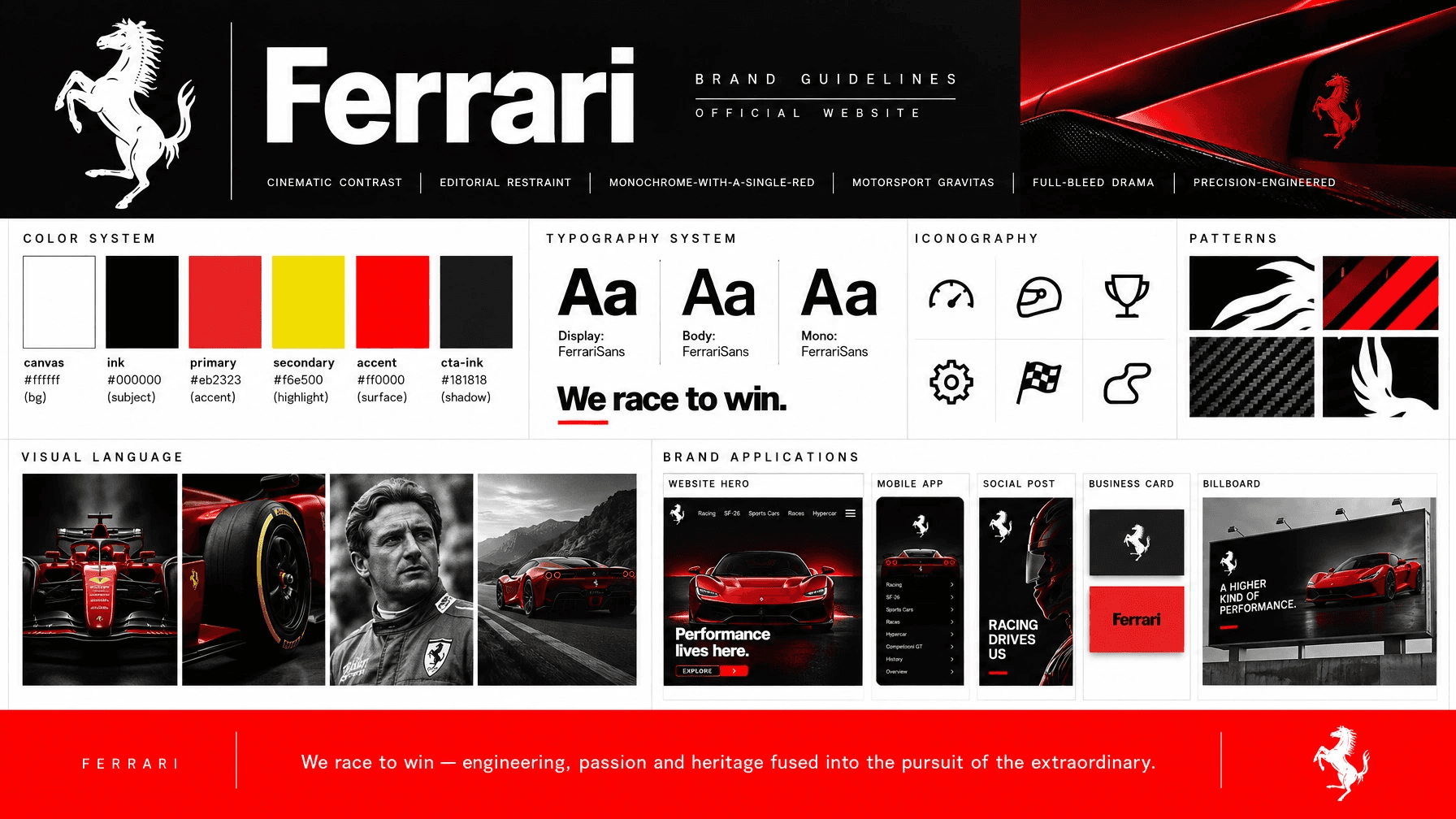
Ferrari uses a palette of canvas #ffffff, ink #000000, primary #eb2323, secondary #f6e500; type set in `'FerrariSans', 'Helvetica Neue', Arial, sans-serif` — headlines, hero titles, all-caps section labels. A clean geometric-humanist grotesque; set uppercase with tight tracking for hero statements. and `'FerrariSans', 'Helvetica Neue', Arial, sans-serif` — running prose, news copy, captions. Regular weight, generous line-height for editorial calm.; a authoritative, passionate, exclusive voice.

Color palette
- canvas#ffffff · bg
- ink#000000 · subject
- primary#eb2323 · accent
- secondary#f6e500 · highlight
- accent#ff0000 · surface
- cta-ink#181818 · shadow
Typography
- primary
- `'FerrariSans', 'Helvetica Neue', Arial, sans-serif` — headlines, hero titles, all-caps section labels. A clean geometric-humanist grotesque; set uppercase with tight tracking for hero statements.
- secondary
- `'FerrariSans', 'Helvetica Neue', Arial, sans-serif` — running prose, news copy, captions. Regular weight, generous line-height for editorial calm.
- mono
- `'FerrariSans', 'SF Mono', ui-monospace, monospace` — year markers, dates, race metadata numerics (e.g. "1951", "2000 · 2001").
Voice
We race to win — engineering, passion and heritage fused into the pursuit of the extraordinary.
Authoritative · passionate · exclusive · confident · heritage-proud · Cinematic contrast · editorial restraint · monochrome-with-a-single-red · motorsport gravitas · full-bleed drama · precision-engineered
Imagery
- High-production automotive and motorsport photography — full-bleed, dramatic low-key lighting, deep blacks (F1 tyre/hero shots).
- Archival black-and-white portraiture for heritage/champions content, treated with subtle grain and grayscale discipline.
- Reserve full-saturation color imagery for cars and partner/product cards; let editorial sections stay near-monochrome.
- Subjects: race cars, drivers, historic champions, craftsmanship close-ups. Avoid stock lifestyle imagery, clutter, or busy backgrounds.
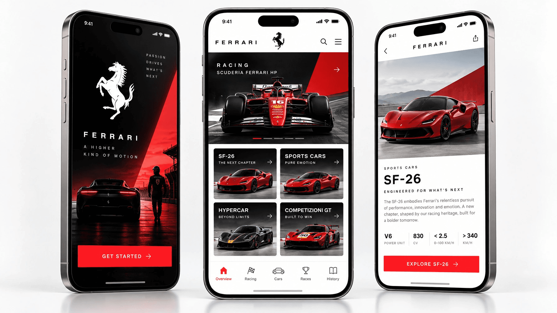
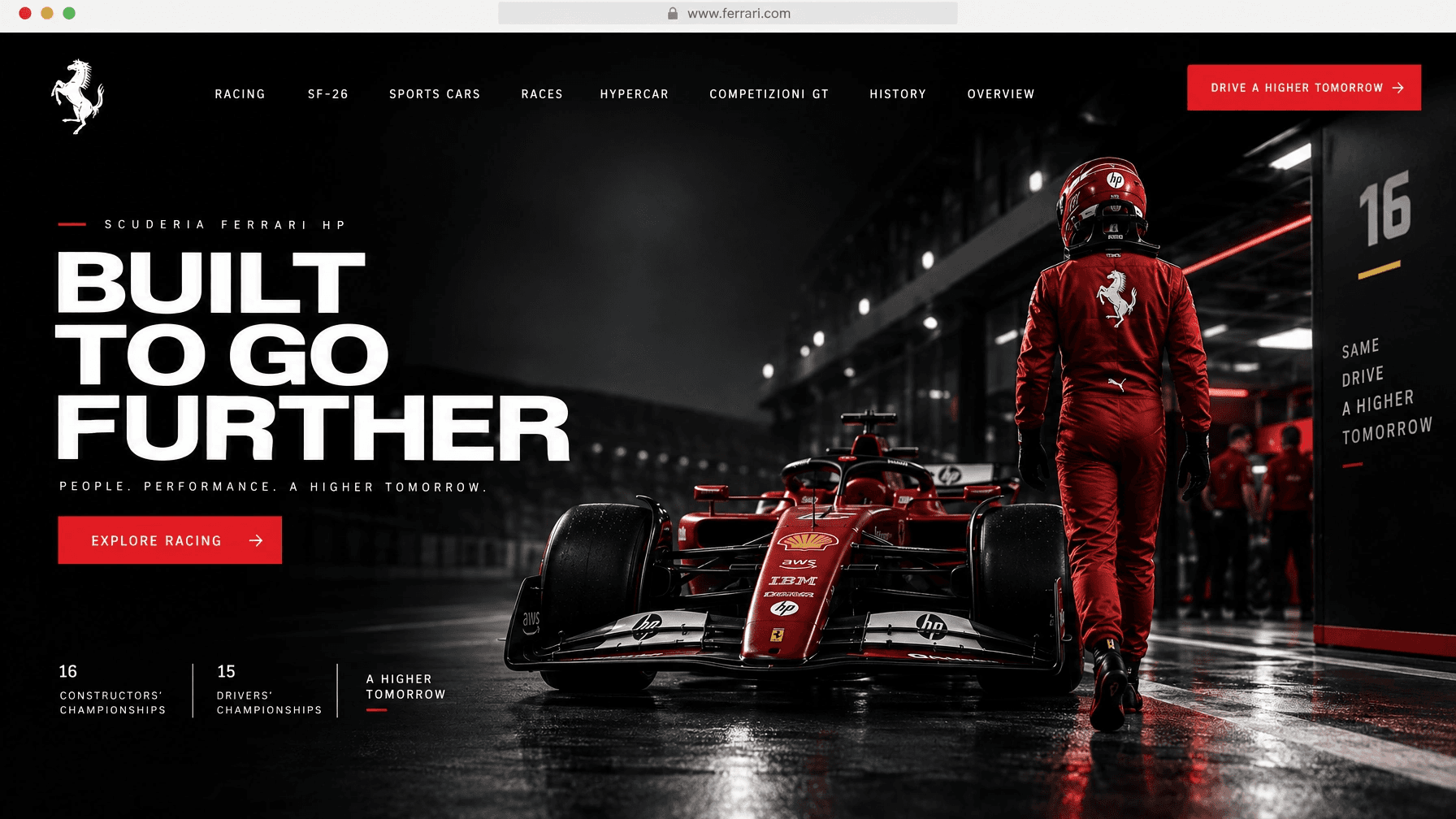
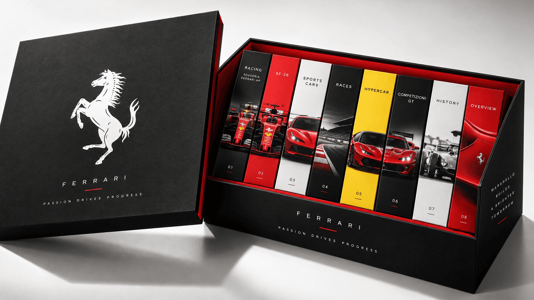
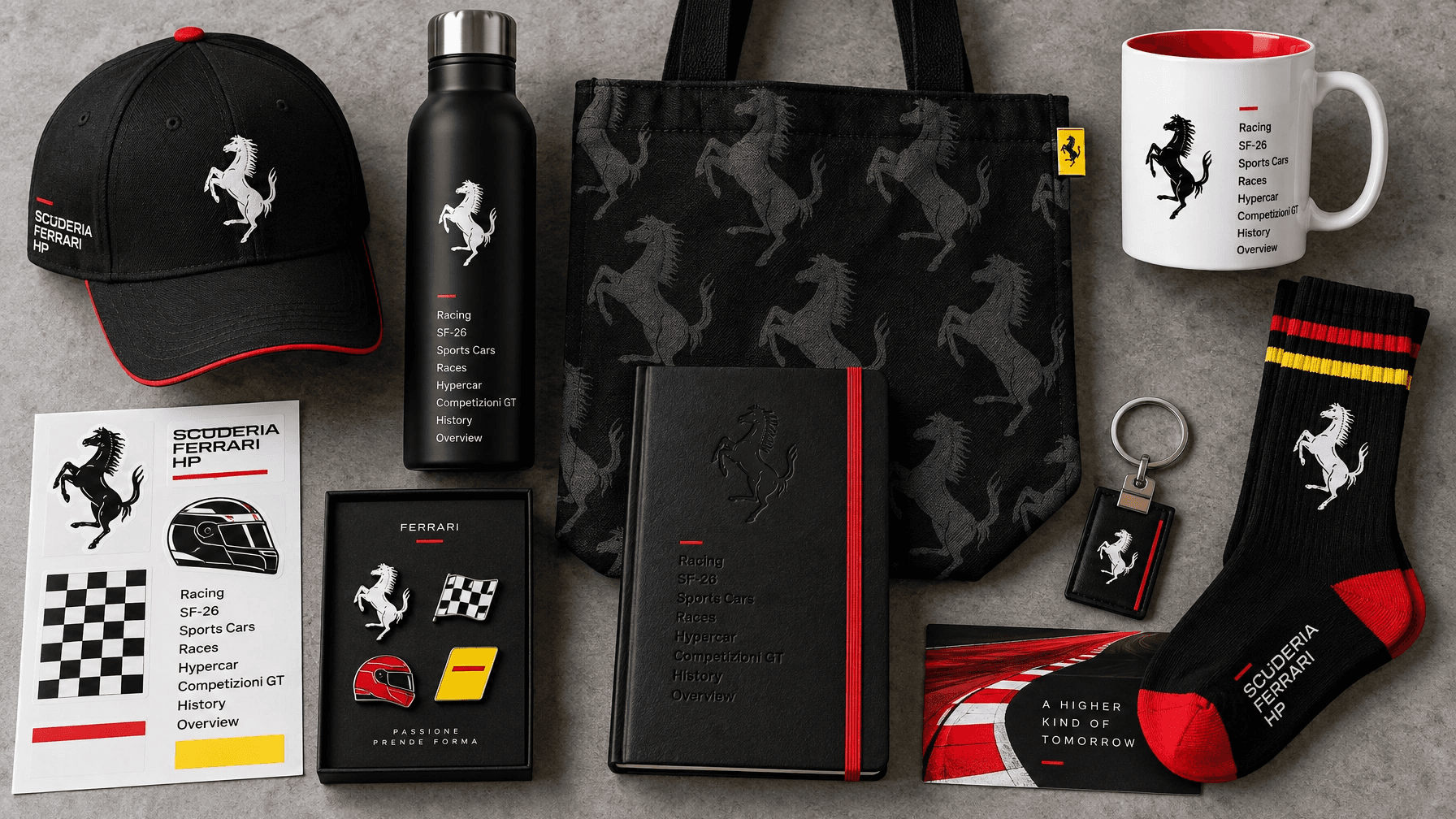
Questions about Ferrari
- What fonts does Ferrari use?
- Ferrari uses `'FerrariSans', 'Helvetica Neue', Arial, sans-serif` — headlines, hero titles, all-caps section labels. A clean geometric-humanist grotesque; set uppercase with tight tracking for hero statements. for display and headlines, `'FerrariSans', 'Helvetica Neue', Arial, sans-serif` — running prose, news copy, captions. Regular weight, generous line-height for editorial calm. for body copy and `'FerrariSans', 'SF Mono', ui-monospace, monospace` — year markers, dates, race metadata numerics (e.g. "1951", "2000 · 2001"). for code and labels.
- What are Ferrari's colors?
- Ferrari's palette is canvas (#ffffff, bg), ink (#000000, subject), primary (#eb2323, accent), secondary (#f6e500, highlight), accent (#ff0000, surface) and cta-ink (#181818, shadow).
- How do I make content in Ferrari's style?
- Write in its voice: We race to win — engineering, passion and heritage fused into the pursuit of the extraordinary. Tone: Authoritative, passionate, exclusive, confident, heritage-proud. For imagery: High-production automotive and motorsport photography — full-bleed, dramatic low-key lighting, deep blacks (F1 tyre/hero shots). Archival black-and-white portraiture for heritage/champions content, treated with subtle grain and grayscale discipline. Remix Ferrari's Brand DNA on Northlit to generate ads and social posts in this style, or use it with your agent from https://northlit.ai/community/brands/official-ferrari-website/dna.
Brand DNA (full spec)
# Ferrari — Brand Spec

## 01 Brand Overview
Ferrari is the definitive luxury performance marque — Italian racing heritage rendered as cinematic, high-contrast digital theatre. The identity fuses the Prancing Horse's black-on-white authority with the unmistakable Rosso Corsa accent, positioning the brand at the intersection of motorsport legacy, engineering precision and exclusive craftsmanship. Every surface reads as a stage: full-bleed imagery, editorial restraint, and a single decisive burst of red.

## 02 Color Palette
```
- name: canvas
  role: bg
  light: oklch(100% 0 0)
  dark:  oklch(15% 0 0)
  hex:   #ffffff
```
```
- name: ink
  role: subject
  light: oklch(0% 0 0)
  dark:  oklch(0% 0 0)
  hex:   #000000
```
```
- name: primary
  role: accent
  light: oklch(58% 0.223 27)
  dark:  oklch(58% 0.223 27)
  hex:   #eb2323
```
```
- name: secondary
  role: highlight
  light: oklch(90% 0.181 100)
  dark:  oklch(90% 0.181 100)
  hex:   #f6e500
```
```
- name: accent
  role: surface
  light: oklch(56% 0.256 29)
  dark:  oklch(56% 0.256 29)
  hex:   #ff0000
```
```
- name: cta-ink
  role: shadow
  light: oklch(18% 0 0)
  dark:  oklch(18% 0 0)
  hex:   #181818
```

## 03 Typography
- Primary (display): `'FerrariSans', 'Helvetica Neue', Arial, sans-serif` — headlines, hero titles, all-caps section labels. A clean geometric-humanist grotesque; set uppercase with tight tracking for hero statements.
- Secondary (body): `'FerrariSans', 'Helvetica Neue', Arial, sans-serif` — running prose, news copy, captions. Regular weight, generous line-height for editorial calm.
- Mono (optional): `'FerrariSans', 'SF Mono', ui-monospace, monospace` — year markers, dates, race metadata numerics (e.g. "1951", "2000 · 2001").

## 04 Voice
### Values
"We race to win — engineering, passion and heritage fused into the pursuit of the extraordinary."

### Aesthetic
Cinematic contrast, editorial restraint, monochrome-with-a-single-red, motorsport gravitas, full-bleed drama, precision-engineered.

### Tone of Voice
Authoritative, passionate, exclusive, confident, heritage-proud.

## 05 Layout posture
- Full-bleed cinematic hero panels alternating black and white sections — high-drama vertical rhythm with hard section breaks.
- Centered, all-caps display titles with a small overline label ("Racing", "Collections") and a circular discover-arrow CTA.
- Zero-radius, dividerless composition — structure comes from tonal blocks and generous negative space, not lines.
- Signature flourish: a single Rosso Corsa card or button punctuating otherwise monochrome pages.

## 06 Anti-defaults
- Never rounds corners — radius is strictly 0px everywhere, including buttons and cards.
- Avoids multi-color palettes; red and yellow appear only as isolated accents against black/white, never blended.
- No drop-shadows or soft elevation — components sit flat on tonal fields.
- Avoids casual or playful copy; nothing diminutive or ironic.
- Typography inferred as FerrariSans grotesque from the site facts; letterform detail not fully legible in screenshots so fallbacks are Helvetica-class grotesques.

## 07 Logo
- The mark is the Cavallino Rampante — a solid, organic silhouette of a rearing prancing horse, hand-drawn in flat black with fine mane and tail detailing. Not a wordmark; a heraldic symbol.
- Provide black-on-light and white/knockout-on-dark variants only; the horse appears solid #000000 on white in the header.
- Clear-space: minimum one hoof-height of empty margin on all sides; minimum legible size ~24px tall for the standalone horse in nav.
- Never recolor the horse off-palette, never add gradients or the yellow shield background where the clean silhouette mark is specified.

## 08 Imagery
- High-production automotive and motorsport photography — full-bleed, dramatic low-key lighting, deep blacks (F1 tyre/hero shots).
- Archival black-and-white portraiture for heritage/champions content, treated with subtle grain and grayscale discipline.
- Reserve full-saturation color imagery for cars and partner/product cards; let editorial sections stay near-monochrome.
- Subjects: race cars, drivers, historic champions, craftsmanship close-ups. Avoid stock lifestyle imagery, clutter, or busy backgrounds.

## 09 UI Components
- CTAs come in two forms: solid red rectangular buttons (#eb2323 fill, white uppercase text, 0px radius) and outline circular icon-buttons wrapping a chevron/arrow ("DISCOVER", "READ MORE").
- Primary action buttons use near-black #181818 fill with white text — flat, no shadow, sharp corners.
- Cards are edge-to-edge rectangles with no radius and no border; the Rakuten partner card is a flat red rectangle with centered lockup.
- Nav is a thin fixed black bar with small-caps links (RACING, SPORTS CARS, COLLECTIONS) and a right-aligned SEARCH; secondary sub-nav bar holds a section title and hamburger.
- Carousels use minimal dot indicators plus flat left/right chevrons and a small pause control — restrained, monochrome controls.
- Hover/active states shift link opacity and reveal a thin underline accent rather than color-fill changes.

## 10 Iconography
- Line icons only — thin, uniform ~1.5px stroke, no fill (chevrons, arrows, social glyphs, accessibility figure).
- Chevron-in-circle is the recurring navigation metaphor; corners on the enclosing ring are perfectly circular while UI blocks stay square.
- Icons held to a small, consistent footprint (~16–20px) with literal, universally-legible metaphors.

## 11 Patterns & Data Visuals
- No charts or graphs; "data" is expressed as year labels and championship dates in small red or gray uppercase type (e.g. "2000 · 2001 · 2002").
- Champions gallery uses a rigid 3-up grid of grayscale photo tiles with name-over-image labels split bold/light (JODY SCHECKTER, NIKI LAUDA).
- Empty/ghost sections use very-low-contrast oversized display words ("NATURAL", "SKETCH BODY", "PAST") as background texture on black.
- Decorative motif: repeated horizontal name ribbons faintly tiled behind portraits; a thin red bottom-edge band as a page footer accent.

## 12 Spacing & Grid
- Airy, cinematic spacing built on a 10px base unit; hero and section blocks are tall and full-viewport, giving a slow, deliberate scroll rhythm.
- Content aligns to a 12-column grid with wide gutters; footer resolves into 5 evenly-spaced link columns.
- Section density is low — few elements per screen, large type, and heavy reliance on negative space over dividers.
- Radius scale is a flat 0px system-wide; the only curves are circular icon-buttons and carousel dots.

## 13 Products
- Racing: Scuderia Ferrari HP (service)
- SF-26 (product)
- Sports Cars (product)
- Races (service)
- Hypercar (product)
- Competizioni GT (product)
- History (service)
- Overview (service)